
Brand Guidelines
Style guide and design system for Kammi. Reference for maintaining visual consistency across the entire website.
Brand Colors
Primary Colors
Indigo 600
#4F46E5
indigo-600
Main CTAs, links
Purple 600
#9333EA
purple-600
Gradients, accents
Pink 500
#EC4899
pink-500
Gradients, highlights
Gray 900
#111827
gray-900
Main text
Green 500
#22C55E
green-500
Success, validations
Secondary Colors
Gray 600
#4B5563
gray-600
Secondary text
Gray 100
#F3F4F6
gray-100
Light backgrounds, badges
Gray 50
#F9FAFB
gray-50
Section backgrounds
Yellow 400
#FACC15
yellow-400
Stars, ratings
Main Gradient
CTA Gradient
from-indigo-600 via-purple-600 to-pink-600
Main buttons, accented titles
Colors by Category
Each product category has its own visual identity with a gradient and associated colors.
HR administrative management
Gradient
#3B82F6 → #22D3EE
Light background
bg-blue-50
Border
border-blue-200
Badge example:
AdministrationTalent management
Gradient
#8B5CF6 → #A855F7
Light background
bg-violet-50
Border
border-violet-200
Badge example:
TalentsPayroll management
Gradient
#F59E0B → #FB923C
Light background
bg-amber-50
Border
border-amber-200
Badge example:
PayrollTypography
Main font: Manrope - A modern and readable typeface.
Buttons
Primary Buttons
Category Buttons
Buttons on dark/gradient backgrounds
Package Page Buttons (by category)
Administration (hr-management)
Talents (talent-management)
Payroll (payroll-management)
Cards
Administration
HR administrative management
Talents
Talent management
Payroll
Payroll management
Icons
Using Heroicons (outline, strokeWidth 1.5) for a modern and consistent appearance.
Animations and Interactive Components
Animated components to enhance user experience.
Hero Carousel - Folder Effect
3 stacked images with "folder slide out" hover effect. Used on homepage.
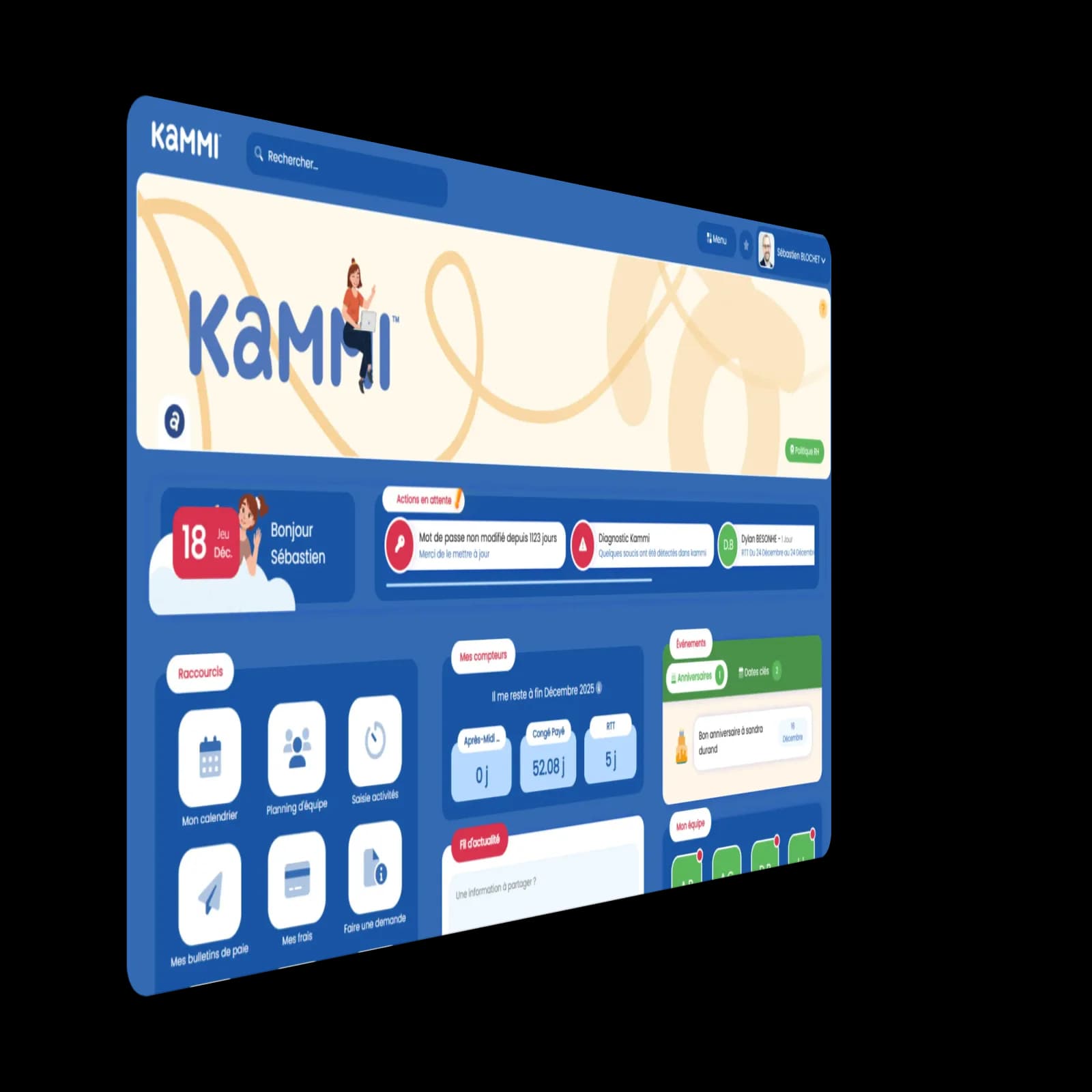

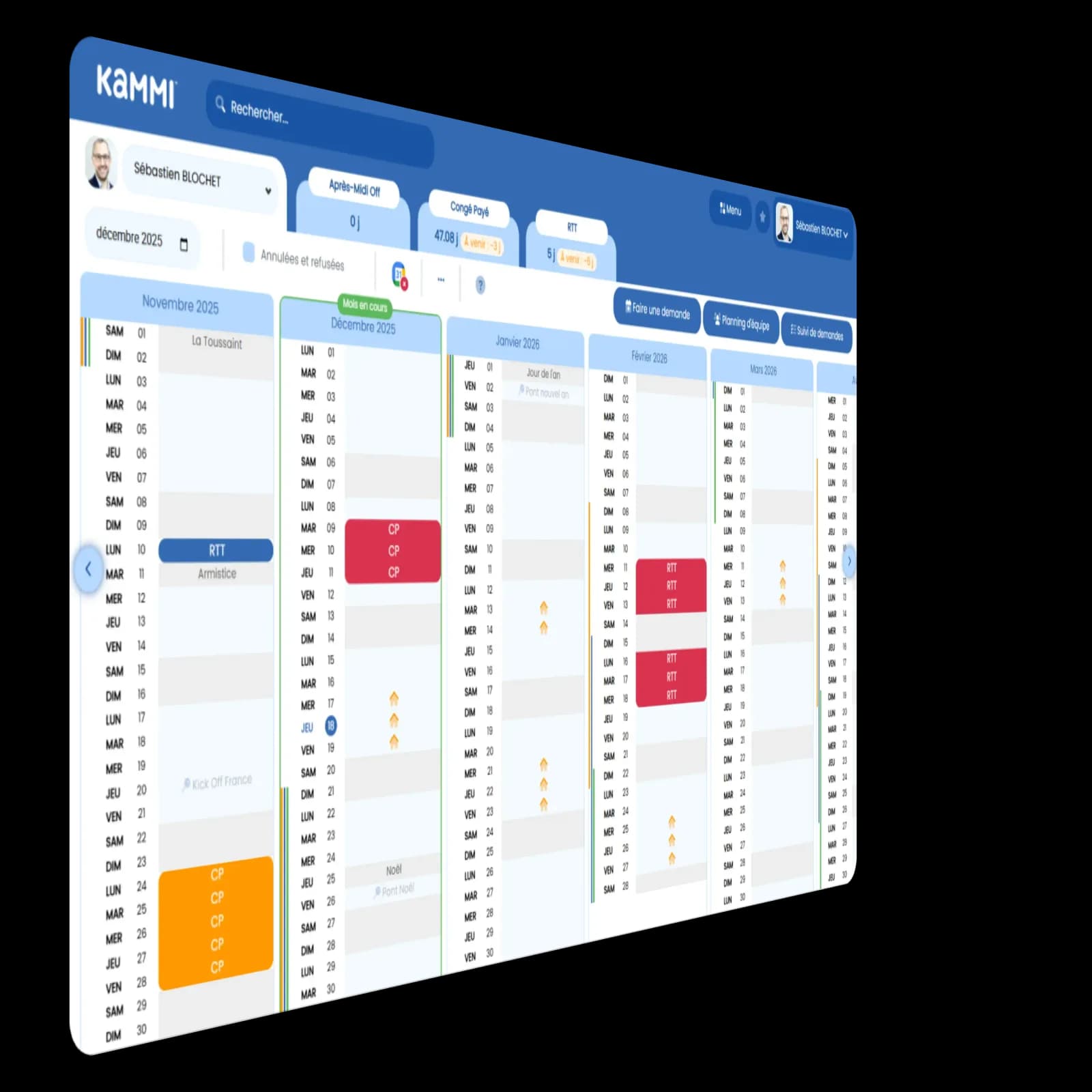
<HeroCarousel />Animated Counters
Counting animation on scroll with smooth easing. Triggers only once.
<AnimatedCounter value={1000} suffix="+" duration={2000} />Transitions and Effects
Fade In on scroll
translateY(24px) → 0 + opacity
transition: 0.6s cubic-bezier(0.16, 1, 0.3, 1)Hover cards
translateY(-4px) + shadow-xl
transition-all duration-300Hover buttons
translateY(-2px) + shadow-lg
hover:-translate-y-0.5Spacing and Border Radius
Consistent use of spacing and border-radius for a harmonious design.